The Role of Reactive Typography in the Design of Flexible Hypertext Documents
Rameshsharma Ramloll
Collaborative Systems Engineering Group
Computing Department
Lancaster University
Email: ramloll@comp.lancs.ac.uk
ABSTRACT
We introduce the concept of reactive typography with the aim of exploiting the nature of electronic text in the design of interfaces to a shared information space. The usefulness of reactive typography is gauged through a few simple experiments. We describe how reactive typography can be used as a medium for in-context data visualisation and argue how this investigation is related to the presentation issues of the product of mechanisms for dynamic document construction and re-use. This relationship is more prominent when considering web agent systems for data mining or relevant information extraction. The latter often provide flexibility at the expense of the user's sense of interaction control because their inference engines often fail to capture accurately the highly dynamic and context specific nature of reader needs. This leads to ‘soft’ issues such as how should agents be designed in order to inspire trust of usage. A step in that direction is to allow the said web agents to reflect their internal state of affairs at the level of information presentation. Reactive typography may have some contribution to make in that respect.
Keywords
Web agents, typography, awareness, data visualisation, and interaction control
INTRODUCTION
ArtLex [Delahunt 95], a lexicon of visual art terminology, defines typography as follows:
The design, arrangement, style, and appearance of type matter constitute typography. Among other things, students of typography learn about the uses of various type fonts, including serif and sans serif, capitals and lowercase letters, boldface, italic, and condensed type, letterspacing (kerning), point sizes, and the various factors affecting readability.
We define reactive typography as a particular kind of typography, which is sensitive to some parameters, selected by a designer. The computer display provides the necessary medium for reactive typography as anything that is displayed on a computer screen is refreshed at a high frequency and as such, is thus not static and liable to be modified meaningfully in real time. A long tradition of static ink on paper has influenced the way text is presented on computer screens. There is a need to exploit the inherent properties of this new medium by identifying new ways of presenting textual information.
Experimenting with reactive typography
The experiments involve the study of simple strategies aimed at enabling the public real time awareness of peer reader views about an online document. This mechanism occurs in arguably two distinct steps. The first is the gathering of the reader’s response and the second is the in-context annotation of the text with information representing the response. Previous researchers [Röscheisen et al 95] have already investigated group or shared annotation techniques and this work does not bring any new contribution in that respect. What is of interest to us here, from a communication designer's point of view, is how to least obtrusively tap data from users, and how to best present it without disrupting the readability of the document or imposing heavy task loads on those who wish to access to this extra piece of information.
Experimental set-up
The chosen online documents are about some controversial topic in order to solicit as many responses as possible from its readers.
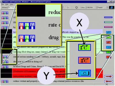
Figure 1
: The icons on the left margin are clicked to input user response while those on the right allows access to different visualisations.In experiment A, ‘marker’ icons to metaphorically represent ‘highlighters’ are provided on the left margin of the document (Figure1). Each marker represents a particular response of the reader about the point of view expressed in the sentence or part of the sentence as the case may be. The red marker is to be clicked if the reader disagrees with the view expressed, the green marker, if the reader agrees with it and finally, the blue one, if the reader is uncertain or entertains a 'could go either way' opinion about it. The readers are of course free to decide when they want to express their opinions, very much in the very same way as highlighters are used with ink on paper. On the right margin, readers are provided with visualisation buttons which when clicked would present them with the same text but this time augmented with a different typographical layout that represents certain specific parameters about the community of readers. For example clicking on the green ‘c’ icon (labelled X) produces a document with the size of the characters representing the degree of consent of the online reader community (Figure 2). Clicking on the blue ‘c’ button (labelled Y), on the right margin will display the background of each sentence with a blue intensity representing the degree of uncertainty of the community about the views expressed in the document (Figure3). In so doing, the reader is able to gauge the opinion of the community of readers at a glance and to quickly identify the areas of consent, dissent or uncertainty.
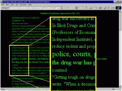
Figure 2
: The size of the fonts represents the degree of consent of the online community of readers (e.g. the greater the size, the higher the degree of consent).
Figure 3
: The blue background colour represents the degree of ‘uncertainty’ about the views expressed.In a different experiment B, readers were able to express their views about a given paragraph by clicking on ‘thumbs up’, ‘thumbs down’ or ‘no idea’ icons. They were also able to visualise the data either by annotating the typographical layout directly or through graphs. For example, in this experiment the background colour expressed the most popular view about the corresponding paragraph.

Figure 4
: In the Active Pages mode, readers are able to register their views for each paragraph by clicking on the three ‘thumbs down’, ’thumbs up’ and ‘don’t know’ icons. Clicking on the ‘v’ and ‘s’ button allows access to feed back visualisations.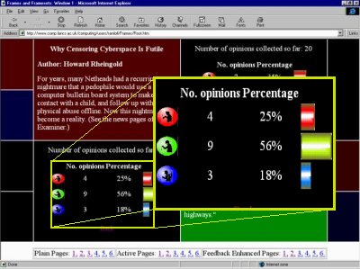
Figure 5
: The reader is also provided with the option of visualising graphically the response of the community of readers.
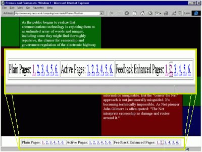
Figure 6
: Readers who are not interested in voicing their opinions or who just wish to gauge the response of the online reader community can simply access the feedback enhanced pages.We realise that there is definitely a lot of scope for improving the granularity of response capture and the visualisations offered but this is out of the scope of this paper as our concern is simply to get some insights into the implications of reactive typography on interface design.
Observations and issues raised
Most of the readers of the online documents were curious to find out what their peer readers thought about its contents. The ubiquitous availability of this information sometimes encouraged readers to go back to the original online document and to voice their opinions, which they haven't before. Most readers showed a preference for the in-context augmentation of text with the extra information rather than displaying it as graphs as is the case in one visualisation option in the second experiment.
Some concerns were raised about not allowing a person to give his her feedback more than once. However, checking if someone has already given his or her opinion already should be done unobtrusively. Any attempt to force readers to register explicitly before expression opinions may in some circumstances dampen any zeal for self-expression. Also opinions do change and ideally, there should be a mechanism that will update the feedback data of a given reader so that at any time it is only the latest feedback that is stored unless there is some special reason that makes the study of opinion shifts useful.
How do these observations inform the design of the presentation component of information filtration agent systems?
The above experiments show that a few simple design strategies can increase the sense of copresence, albeit in an abstract way, among readers of online documents. However, it is obvious that in all the experiments we have been dealing with, simply involves the visualisation of information annotating some text and that the processes that support this visualisation per se do not qualify as agents for the following reason. While they respond in a timely fashion to changes in their environment, are autonomous, and temporally continuous, they fail in one of the most prominent properties of agent systems, namely their lack of a goal oriented or pro-active character [Franklin et al 96]. After putting this possible source of confusion out of the way, we proceed to describe how reactive typography may be useful in the design of the information presentation of web agents for data mining or relevant information extraction. To begin, we revisit an argument usually levelled against such agents. It has often been argued that a pro-active agent may potentially rob the user of her sense of control because of the fact that a piece of software that take care of the information filtering process often has an internal logic which is most of the time hidden. In the following, we show how reactive typography may help to tackle this problem. Even though it is difficult for this approach to expose this internal logic just mentioned, it can certainly express the reliability of the output of the agents concerned.
Let us assume the existence of an agent, which is supposed to help a given user to quickly access Midi files, according to his musical taste, from a given Midi file repository. The web agent may be designed in such a way that when the user reaches the repository site, only the files that match his taste are always displayed. While the agent is certainly successful in helping the user attain the 'right' targets, which have been determined, based on data previously gathered from the user, it is arguably not very flexible for the following reasons. There is always a time lag between the time data was collected and the actual time of interaction so that the solution offered by the agent may not always match the current requirements of a given user. Displaying the files according to some criteria based on some previously collected data, such as an interest profile, denies the user of having access to the knowledge of other Midi files which may indeed fit his current taste or mood. An obvious solution to this problem can involve emphasising in some way, the names of those files that might suit the taste of the user while still presenting her with the other options. A wide variety of visualisation techniques such as fish eye views with multiple foci or a range of typographical techniques exists to achieve this effect. Since, the other files which according to the agent would not be of interest to the user, are still visible in some way, even if they are less prominent, the user can still change his mind or satisfy his immediate need to explore other musical styles. It seems that these cosmetic issues at the level of the information presentation have a non-negligible effect on the sense of control that users experience when being ‘assisted’ by a web agent. Thus as far as possible, web agents should act as prompters or advisers for interaction rather than wholly acting on behalf of the user. Reactive typography enables a ‘soft’ perusal filtering of the information presentation which fuzzifies the output of the agents concerned perhaps as a means to reflect their possible internal accuracies.
Similarly, agents responsible for the reader customisation of online newspapers can exploit reactive typography by identifying appropriate typographical parameters that will allow the automatic spatial layout of articles according to reader interests. Thus, one would expect such a newspaper to have prominent spacious headline articles matching what would most interest the reader and at the other extreme, little snippets in small fonts about events of a lesser degree of interest. Another application scenario that illustrates the importance of reactive typography as a useful ‘soft’ information-filtering stratum is as follows. Often, systems such as ComMentor are designed with the aim of contributing to a culture of widely commenting and reviewing [Röscheisen et al 95]. If this goal is indeed achieved, shared structured in-place annotations [Röscheisen et al 95] are bound to populate on line shared documents. Proper design choices have to be made so that numerous structured in place annotations do not interfere with readability. Reactive typography may provide a possible solution by having for example, annotated text augmented in real time according to the number or content of annotations so that just by glancing at the augmented text, the reader is able to guess the nature of the underlying annotations.
CONCLUSION
The suitability of reactive typography as a medium for ubiquitous user related data visualisation and its relevance to the presentation of the output form a class of agents is explored. We explain how augmenting automatically an existing document with relevant information can achieve multiple browsing contexts. It also seems that embedding information directly in the typographical layout can act as an unobtrusive and useful ‘soft’ information-filtering step in the process of advising rather than directing a user to a desired information source. One advantage of this technique is that it helps to maintain the user's sense of control about information access and interactions. This technique may thus provide a progressive step towards a possible solution to the common lack of user control criticisms usually levelled against web agents. Reactive typography is an area where communication design professionals, typographers, visualisation researchers and web agent designers can collaborate in order to design useful and ‘live’ interfaces to the World Wide Web.
The web interfaces in this paper were built using HTML, javascript and perl and the visualisations were largely constrained by the narrow range of typography parametrisations possible in the hyper text mark-up language used. There is thus a pressing need for specialised services for the realisation of the kind of typographical behaviour mentioned in the paper. We hope that research efforts aimed at providing web designers with the necessary tools to manage the typographical layout at the level complexity that we suggested, will gain more prominence in the near future.
ACKNOWLEDGEMENTS
I wish to thank the referees for their numerous comments to improve the focus and readability of this paper.
REFERENCE
M. Delahunt (1995 ). |
ArtLex, a lexicon of visual art terminology , http://www.aristotle.com/sskystorage/Art/ArtLex.html |
Stan Franklin and Art Graesser (1996). |
Is it an Agent, or just a Program?: A Taxonomy for Autonomous Agents, Proceedings of the Third International Workshop on Agent Theories, Architectures, and Languages, Springer-Verlag, 1996. |
Martin Röscheisen, Christian Mogensen, and Terry Winograd (1995). |
Beyond Browsing: Shared Comments, SOAPs, Trails, and On-line Communities. Paper presented at the Third International World-Wide Web Conference in Darmstadt, Germany, April 1995. |